|
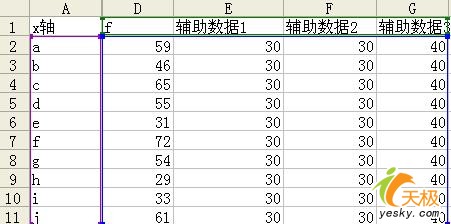
data in normal Excel table, the data fall on what the region is not very clear, especially in the distinction between the individual alert when the data shown in Figure 1
this expression is difficult to distinguish which points fall on the warning line 30 below, which fell 60 points or more, how to solve this problem? we can set up auxiliary data to the table horizontal separation.

As shown, the establishment of auxiliary data Auxiliary data 1 and 2, auxiliary data that is required limits the number of warning, of course, can be three, four or even more, here only cite three of the auxiliary data. $ Show_page $ will complement the series of copy and paste the data table, or select data and ancillary data to establish stacked column chart with the results shown in Figure 3
left activation data that is purple prism, and then right-click the activation section, select the chart type, as shown
select line chart data points, the effect as shown:
Right vertical axis, set the content as shown:
activate the bottom left column of dark red body, right-click the selected data series format, specifically chosen as follows: 1, pattern - Borders - No; 2, pattern - color - any 3, Options - Categories interval - 0 activate the middle of the left yellow prism, right-click the selected data series format, specifically chosen as follows: 1, pattern - Borders - No; 2, pattern - colors - white activate the top left blue prism, right-click the selected data series format, specifically chosen as follows: 1, pattern - Borders - No; 2, pattern - color - any; results shown see, use the auxiliary series Pianjiang super alert chart data clearly displayed. $ Show_page $ This is a horizontal split, vertical split them if it is to be? of course, can also be achieved using auxiliary data, stacked column chart still selected, and the figure shows, the establishment of ancillary data 1:
then set according to the method described earlier charts, renderings are as follows:
noted that each column of the grid, that is marked in red on the map grid, left-click any one and it was left-click will activate a separate column grid, then right-click the selected data point format, as shown show, free to set the color:
and so on, to each cell are set in different colors according to plan, the final results as shown below, to the role of the longitudinal split of the chart.
clever a few simple settings, we can chart any vertical and horizontal segmentation, flexible use of all the basic functions of excel, makes a refreshing feeling. Look under the map, red represents the results of 2006, the blue section represents the results of 2007, clear it.
Oh, and here there is a technique that F4 and health, when we step forward and one step after the operation the same time, we can point F4 to repeat the previous action, as shown above, as the second pillar and The first column into the same color, the operation is the same, so I Xuanze in the first column of pink, the selected columns directly after the second point of F4 on it, and so on, and soon some of the pink buttoned up. |