Office software is closely linked to the PDF,the PDF is also must have to control!
Set home Page Add to Favorites
|
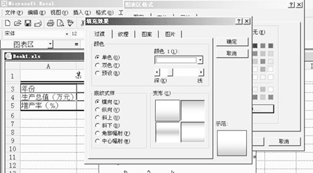
Beauty for the chart Graph generated after the middle of the graphic is too small and too much text around, looked very uncomfortable, we can be modified to make it beautiful. Specific practices are as follows: 1, click the right mouse button, pop-up dialog box, select [Format chart area], the pop-up dialog box format chart area, first of all, shows the pattern tab, select the [shadow of (D)]. Click the [fill effects] button in the dialog box fill effects you can choose your favorite background effects, we in the transition tab and select "Monochrome", "light green", will be transferred to a suitable depth of color, such as Figure 4, and then choose the default shading style "horizontal", click [OK]. 
Figure 4
2, modified the same way data series graphics area and the district. 3, now the text and some charts, and graphics areas and small. Click the longitudinal axis of the chart, in the name column to choose a smaller font, or double-click a series of modification of its longitudinal axis, such as font, size, bold, scale and so on. The same way and then modified the horizontal axis. 4, the title and legend on the chart for modification, modify font, size, and fill effects, the same as the basic and above. 5, below, we have horizontal and vertical axis indicate the title be modified, if the chart has been heading that way more than can be used, if not, click in the graphics area with the right mouse button, from the shortcut menu select [chart Options], options in the chart and fill in the chart title Abscissa, Ordinate heading, click [OK] to. 6, Finally, we adjust the size of the various parts, and make the appearance of coordination. This step can be done with the mouse, make the chart shown in Figure 5. The effect is not good?  Figure 5 |