Office software is closely linked to the PDF,the PDF is also must have to control!
Set home Page Add to Favorites
|
Microsoft Excel 2000 in the corporate office, data processing with powerful functions. However, how the Excel worksheet data to create charts and to generate links, but many people know little about. We have a factory the following from 1990 to 1995 the total value of industrial production as an example to illustrate the generation of bar graph form with the linking process.
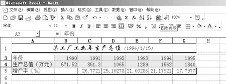
Production chart Microsoft Excel 2000, many of the chart template, in the production and sales, often used to describe the bar graph, so that is conducive to that and to analyze its trend. Steps to create the chart as follows: 1, selected years, and two lines of the GDP value, click the [Chart Wizard], in Figure 1. In the Chart Wizard dialog box, select Column chart type, select the type of sub-graphs Clustered Column, click [Next].  Figure 1
2, source data in the chart appear in the data "= Sheet1! $ A $ 3: $ G $ 4", "series produced in the" Choice "line" in the classification of a series of signs in X-axis fill "= Sheet1 ! $ B $ 3: $ G $ 3 ", Series dialog box to delete the" year ", click [Next], in Figure 2.  Figure 2
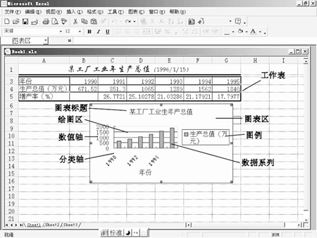
3, fill in the Chart Options Chart title, X axis and Y-axis name, click [Next]. 4, location in the chart "as the object of which the words" fill "Sheet1", click [Finish] to generate the chart, as shown in Figure 3.  Figure 3 |